Oxygen Design System
Creating O2's scalable design system: the foundations that powered their online transformation
Background
O2 was undergoing a major digital transformation, launching a new brand identity alongside it. Their existing design system had become outdated: it was unresponsive, inaccessible, and built on legacy tools, Sketch and Invision Studio.
O2 needed a new design system that would be modern, accessible, and human-centered — built using the latest design technologies and best practices.
Customer experience was a priority; O2 recognized that better digital experiences meant stronger brand loyalty and reputation. A complete overhaul of their website and apps would only be possible by first reworking the foundations: the O2 Oxygen Design System.

My role
As a UI and design system designer, I worked alongside a design system lead as a core part of the team. The lead focused on migrating and updating the existing system, whilst I delved in the discovery and design of new components required by product workstreams (eCommerce, ePOS, and eCare).
Approach
My approach combined deep research into requirements, user needs, and accessibility best practices, followed by careful design, testing, and documentation of each component to give guidance on use.
We applied Atomic Design principles and structured all components using an 8px grid system.
We used the following hierarchy in our system: foundations, components, patterns, and templates, and defined breakpoints to design with, to ensure we created a responsive experience:
XS: Mobile (320–567px)
S: Large Mobile / Small Tablet (568–959px)
M: Tablet (960–1079px)
L: Desktop (1080–1920px)
XL: Large Desktop (1920px+)
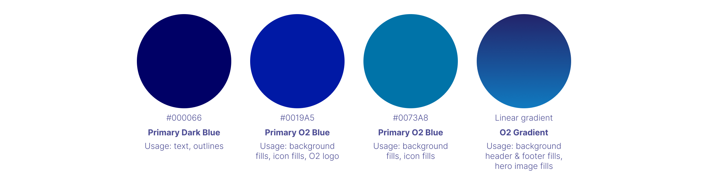
Spacing, layout rules, and typography choices were set for each breakpoint, ensuring visual consistency and optimal readability on all devices. A minimum text size of 14px was enforced across all platforms to enhance legibility. Accessibility was a non-negotiable foundation. We crafted our color styles and typography to meet WCAG 2.1 AA standards, supporting users across all abilities.
Project highlight
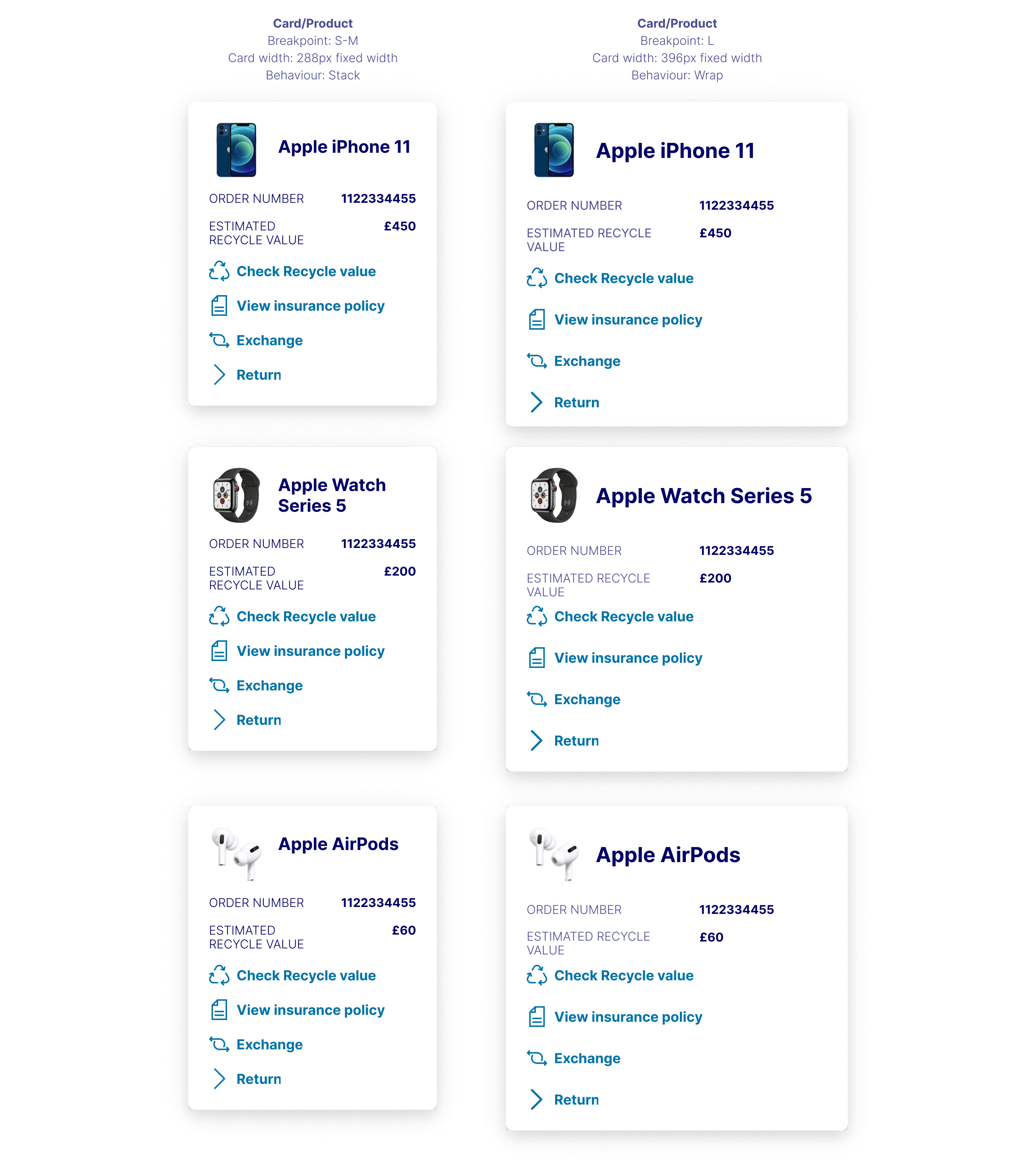
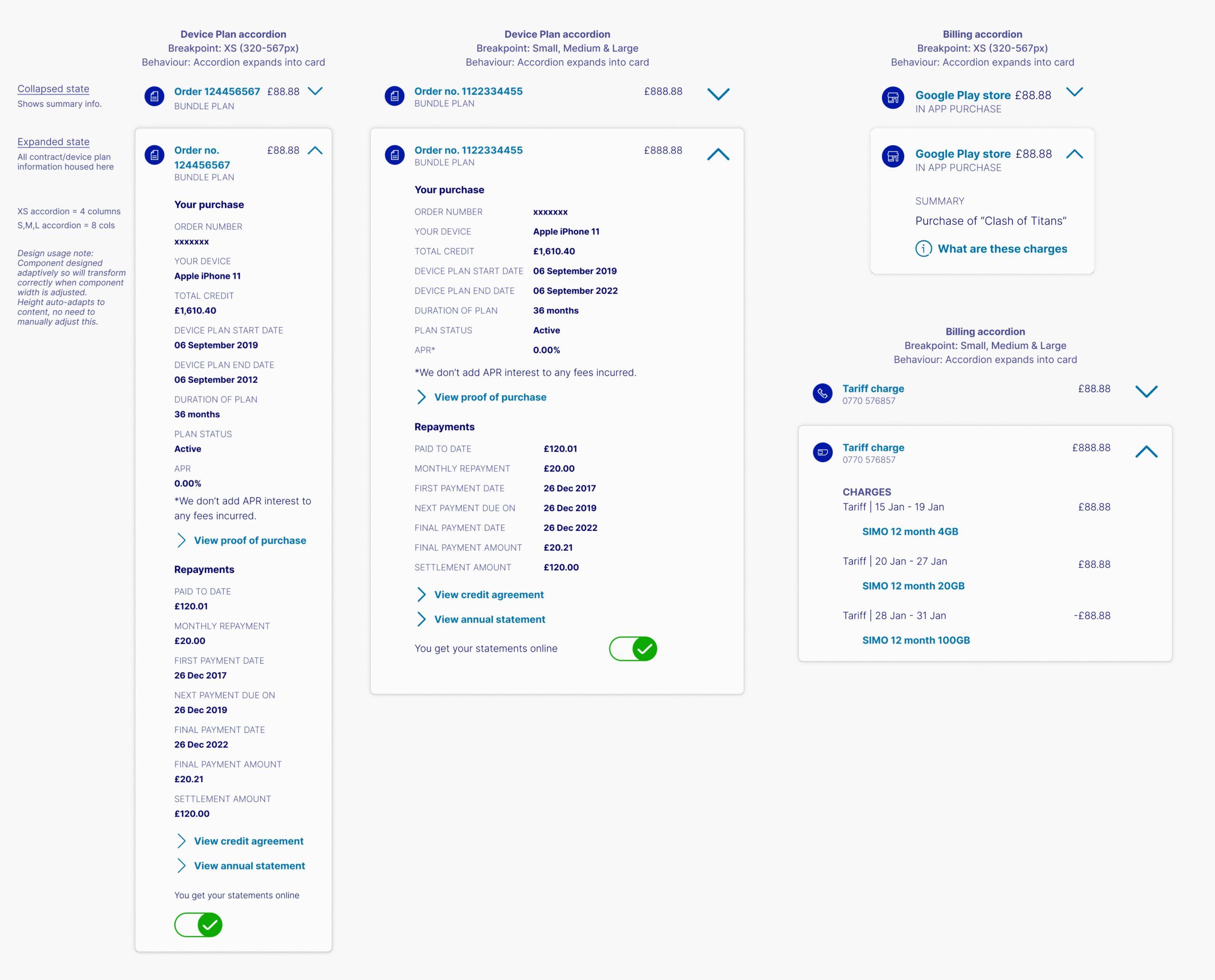
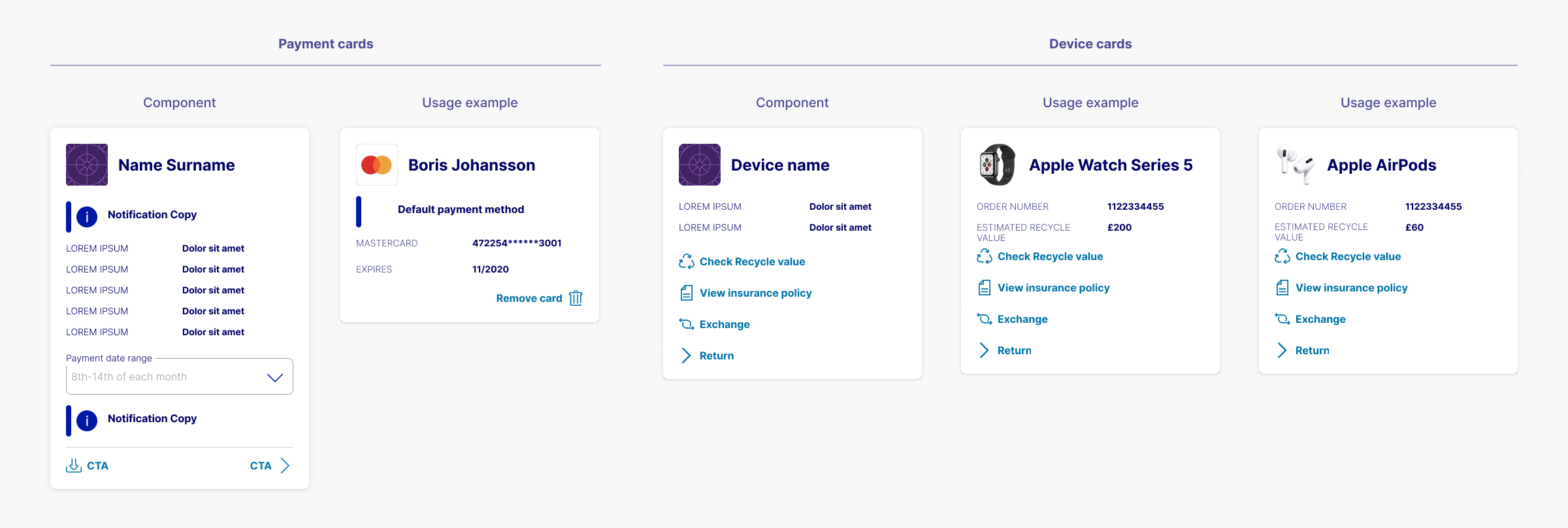
One of the most impactful components I designed was the Wallet Card — a modular card used to display saved payment methods in customer accounts. Initially I scoped out the requirements for its use in the logged-in customer experience, then rolled it out for further use in a customer's shopping basket.
Its initial success led to us evolving it into a multi-purpose Device Card and Billing Card, showcasing device and tariff charges with the same familiar UI patterns.
Its reuse validated our scalable approach and demonstrated how thoughtful component design can create a more relatable, seamless experience for users.
Collaborating for impact
Our focused team maintained tight collaboration and frequent communication to ensure we delivered a new system that felt cohesive and modern.
By rebuilding the Oxygen design system with the latest accessibility standards, responsiveness, and human-centered thinking at its core, we provided the foundations for O2’s next-generation digital experiences, ensuring that their customers - no matter their device or ability - could engage with their services easily and confidently.